(01) Overview
Less form. More character.
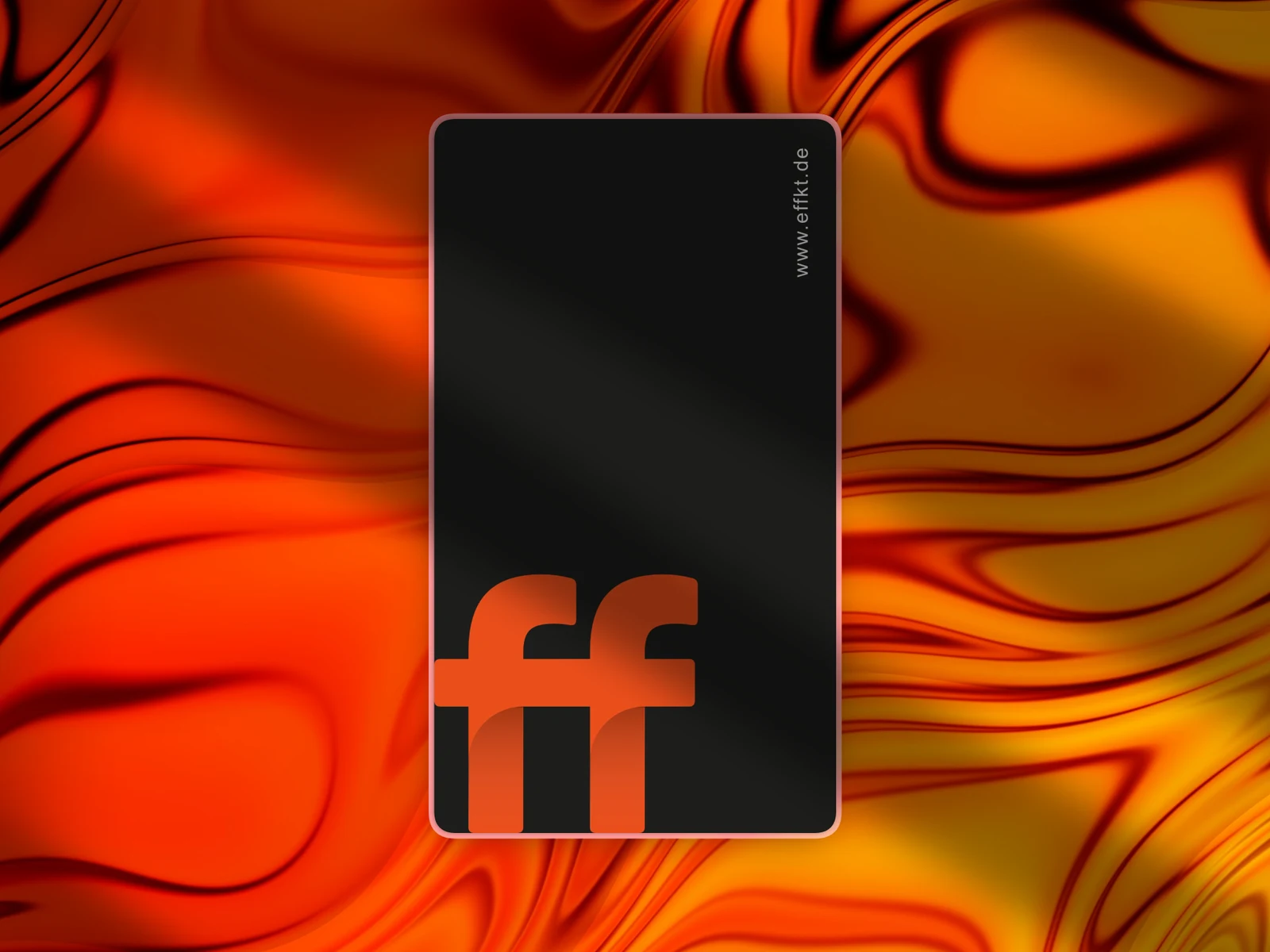
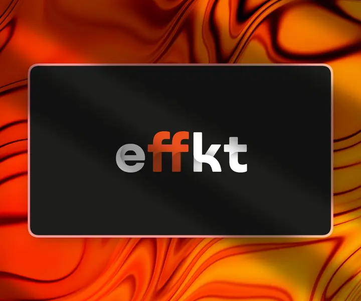
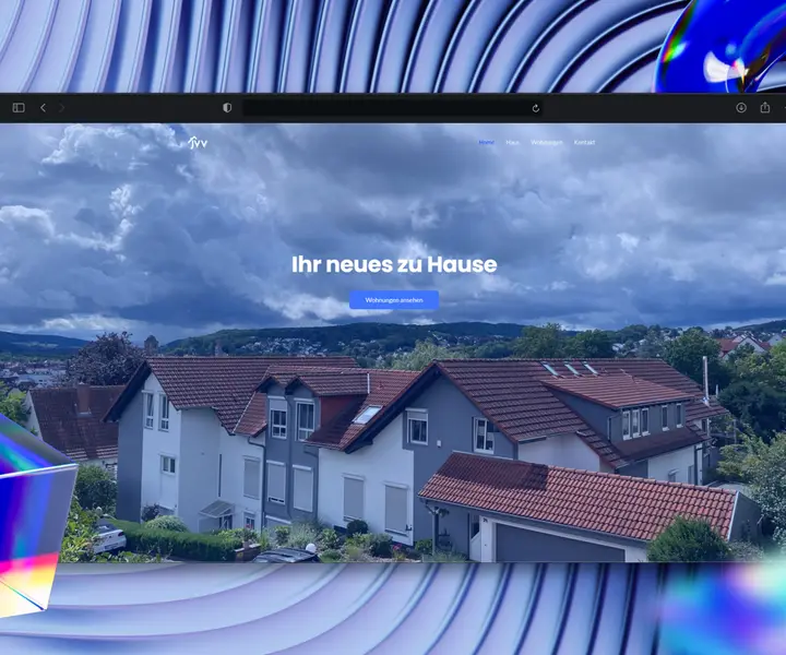
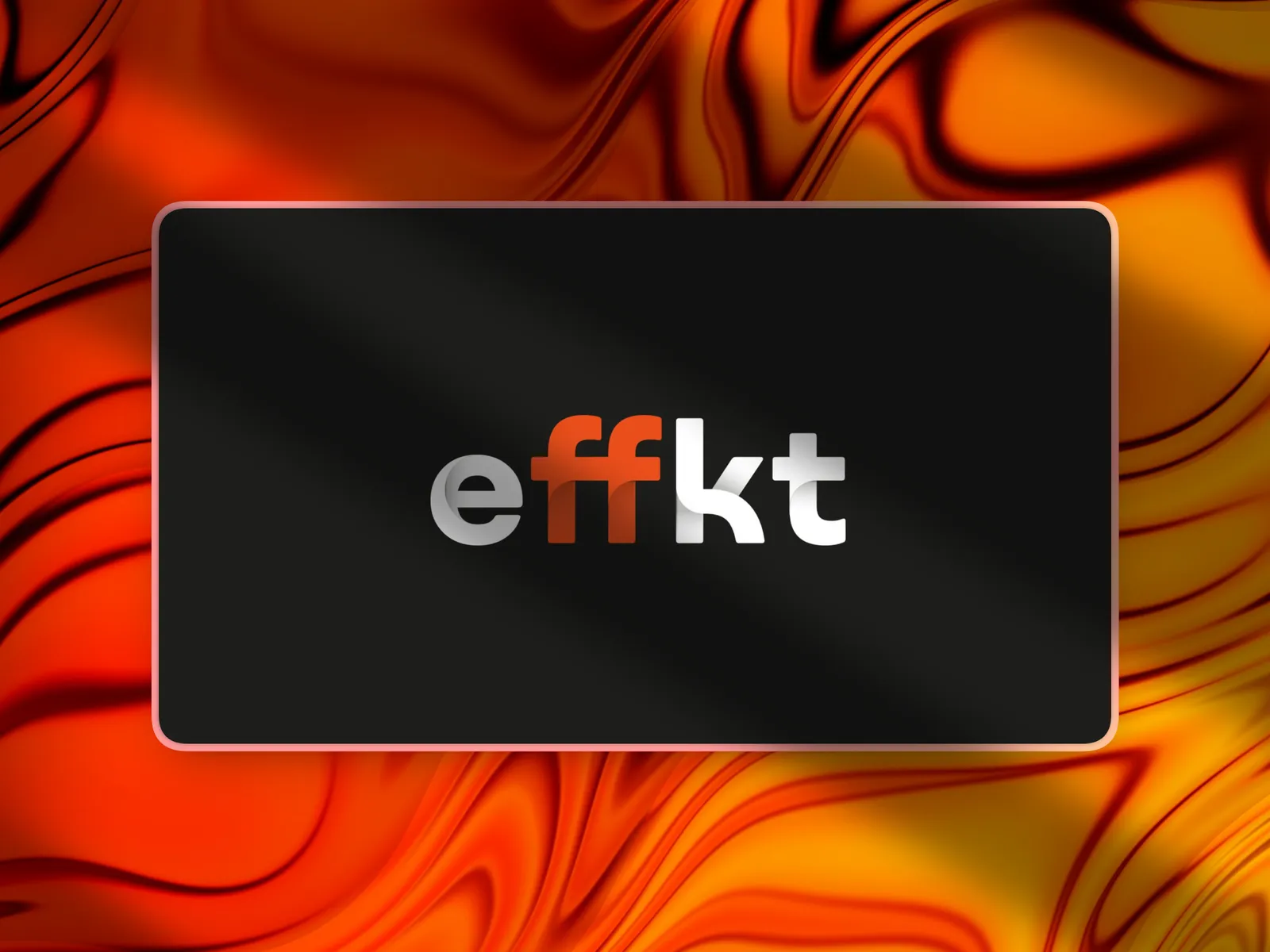
Logo, business cards and print assets with a clean, minimal design. The tactile finish brings the identity to life beyond the screen.
MY PART designing the identity and the print pieces.
(02) Brand
Straight from the ff.
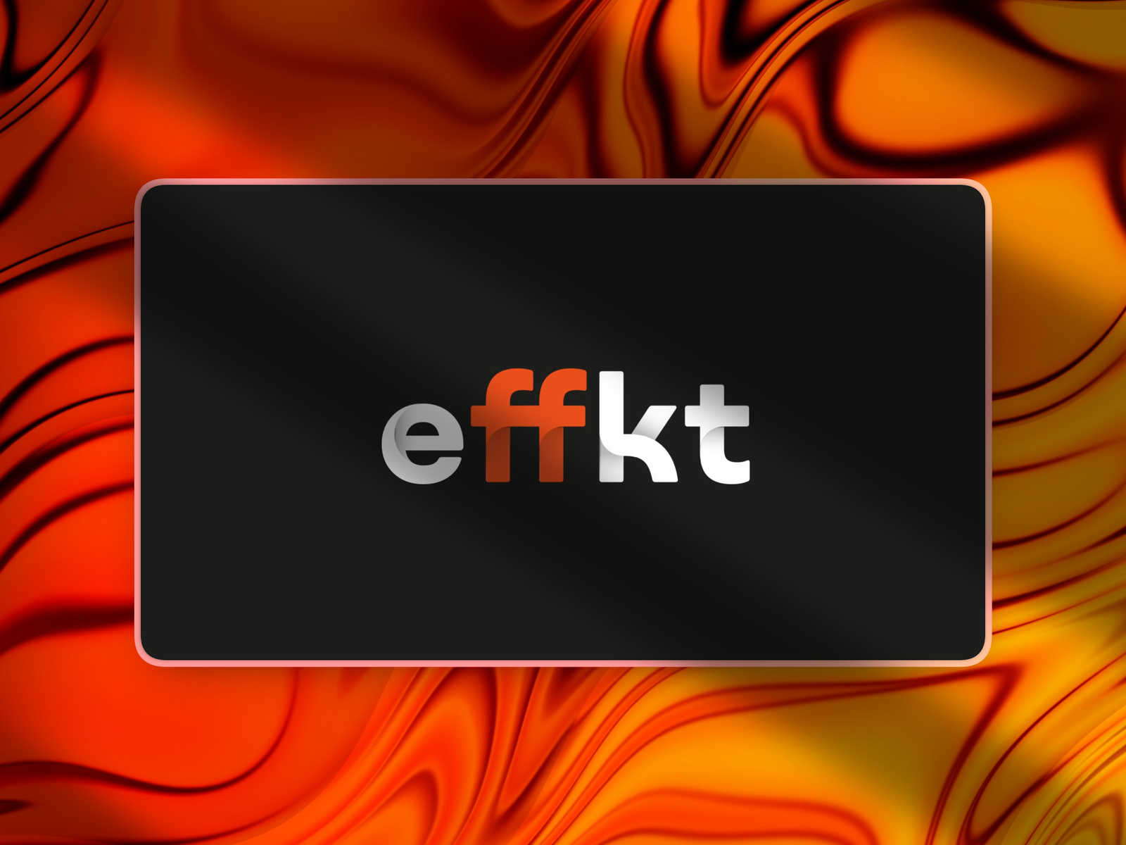
The wordmark lives on its orange “ff” ligature and subtle shadows. Modern and clean, but with a craftsman’s precision.
(03) Print
A logo you can feel.
Premium business cards built in InDesign, plus a separate print file for spot UV. That gives the logo a tactile 3D effect and a classy shine.