Skip to content

Designer from Hesse, Germany.
Digital. Print. Open tabs.

Oliver Skibbe

A trade with

a clear mark.

(Client)Roofing company
(Year)2023
(Discipline)Logo Redesign / Trades
(Tools)Illustrator

oliver-skibbe

(01)
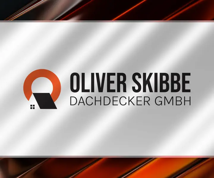
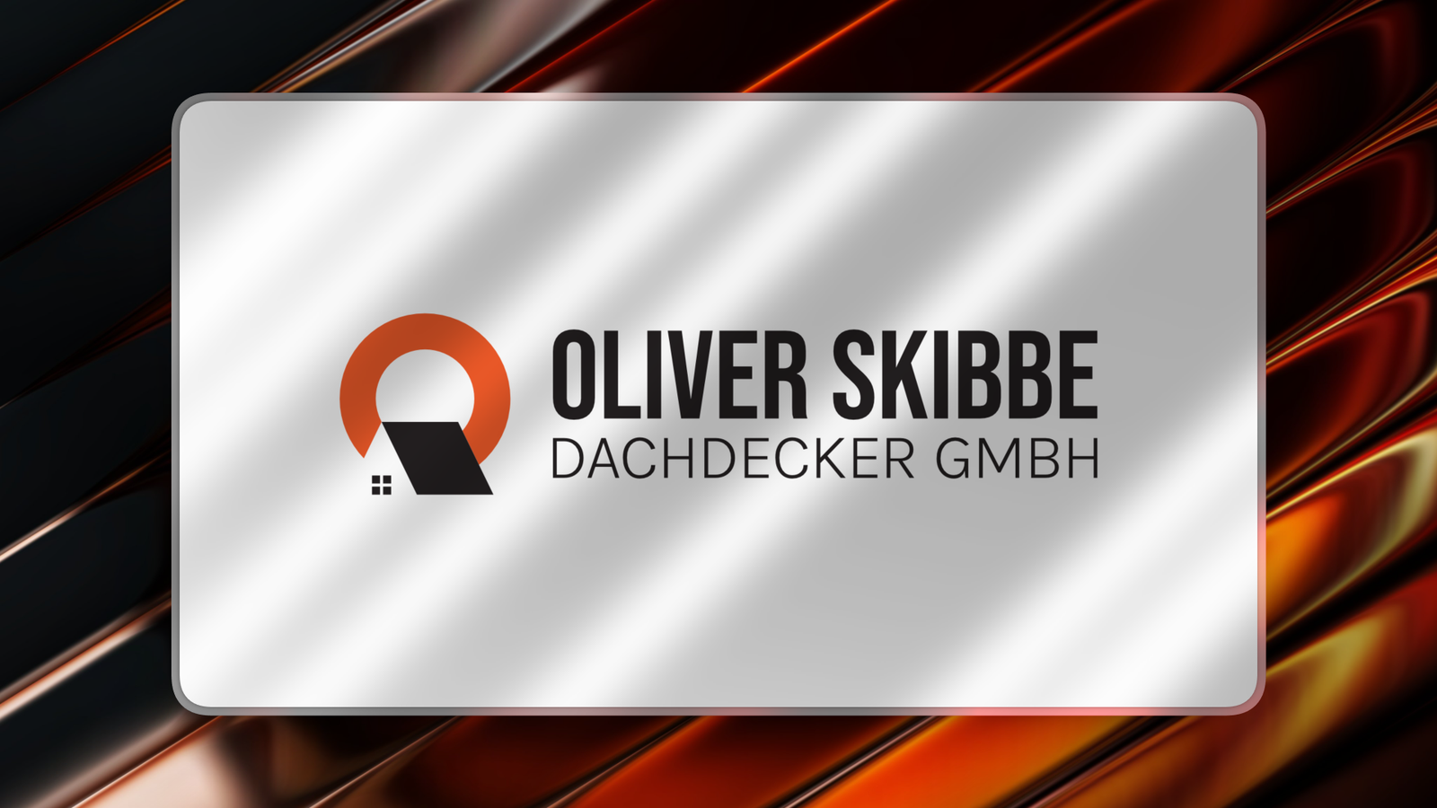
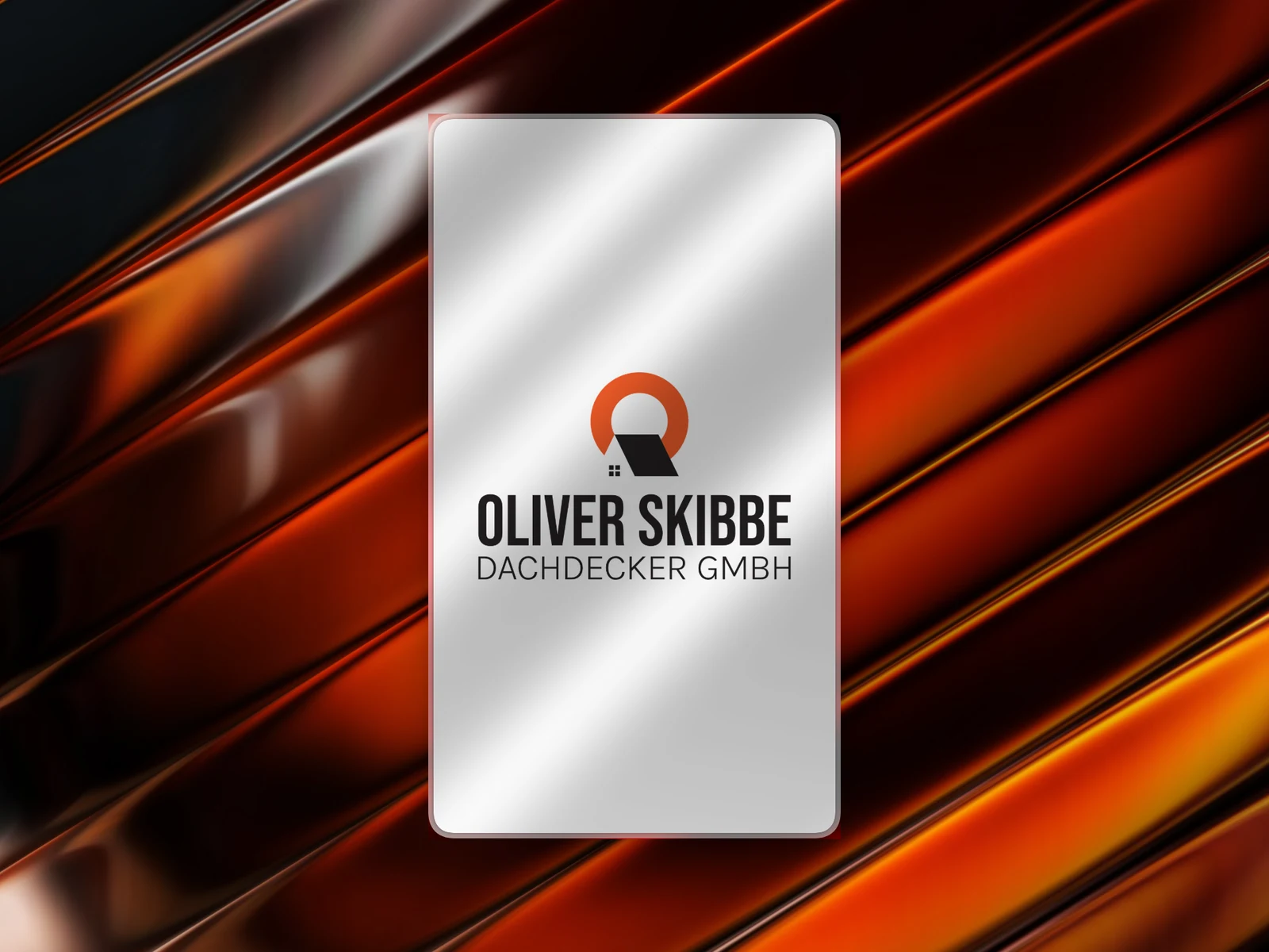
Oliver Skibbe roofing logo

(01) Overview

A mark that fits the trade.

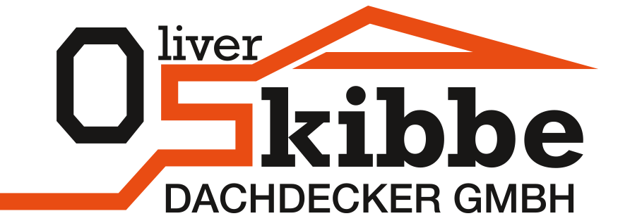
A logo redesign for a roofing company. The geometric design gives it a bold presence and picks up on the craft behind the business.

MY PART redesigning the logo.

(02) Brand

The sun rises over the roof.

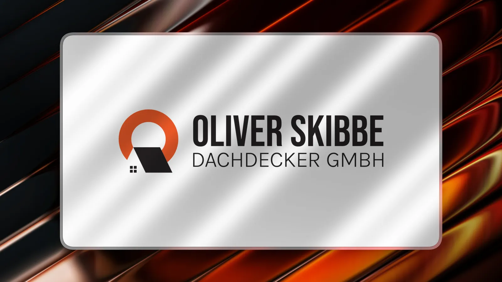
The “O” becomes a rising sun, paired with an abstract roof silhouette and a small window. Negative space and cropped lines keep the mark airy, while warm orange adds the contrast.
THE NEXT TAB.

(05 / 05)

This Site.

The toughest client is me.

OR JUST KEEP SCROLLING

this-site

(05)
Home page of the new portfolio with the headline Tabs in my head. Design in my hands.
OPEN PROJECT